A lot of people think responsive web design is just about squeezing and stretching. It is much more than that – It’s about delivering one website numerous ways depending on screen size, platform and orientation.
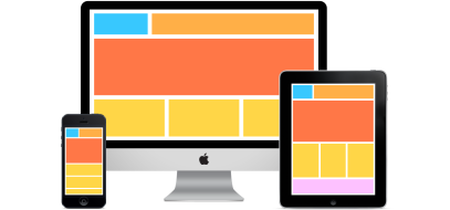 Your website does not need the intricate design and performance of a desktop site on a mobile device. Mobile users may not need some of the content and functionality of desktop when viewing your site on their smaller screens. They express different behaviors and needs than your desktop users. For example, many mobile users do not appreciate navigating numerous pages just to find your phone number or address. They will quickly exit your site for a competitor’s more responsive and user friendly website. We’re talking smooth CSS, media queries, flexible grids & layouts and intuition as essential ingredients to creating a state-of-the-art RWD that your users would enjoy.
Here are some RWD best practices to help you create the optimal user experience for your web visitors.
Navigation
Desktop websites typically have a noticeable menu navigation at the top of the page. That navigation setup takes up valuable space on mobile. That is the reason mobile menus are usually drop down, or icons, on the top or bottom of the screen.
In fact, the best way to save space and keep the site clean on smaller screens is to completely hide the navigation menu and point the user to it with the help of an icon or text. The Hamburger icon is a great example to this and we had a great debate about it in class.
Alternatively, you could also keep the menu visible but let the content overflow on the edge of the screen for users to swipe to reveal more.
Images and Icons
Images and icons are important components of user experience, particularly on smaller screens. It is important for images and icons to be flexible enough to be viewed optimally on devices with high pixel density. Images have to look clear and sharp across all screens.
Simple and Focused Content
Keep your content simple. This is a crucial rule to keep in mind for responsive web design. Mobile users are usually on the go and want to access information at the first touch of their fingers. Therefore, it is vital for every page to have a central focus.
The goal is to do whatever it takes to make navigation and access easy for users. Use icons and text to help them find what they’re looking for.
Font Weight and Size Ratios
Large headers can look quite awkward on mobile, particularly if they take up a few lines. It is important to resize headers and keep them in perfect ratio to paragraph text when creating a responsive site.
Also keep in mind that more and more mobile devices have high resolution screens which make text more clear and legible. Therefore, you could make the font smaller on mobile screens and increase it for larger display screens.
Design Specifically for Touch
Touch is the main mode of interaction on mobile devices which means that a higher degree of sensitivity needs to be factored in. You need to keep in mind various finger shapes and sizes and different pressure points when creating forms, buttons and other elements that require touch to activate them.
The elements have to be large enough to not overlap with neighboring elements, and easy to tap. In fact, large buttons improve usability on all devices, mobile or desktop.
Keep Forms Minimal
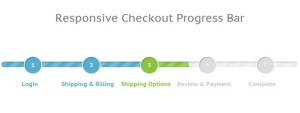
Typing isn’t much fun on small screens. It is important to keep forms simple and as easy as possible for your users to fill out. It is recommended that you keep a separate form for mobile users – a form with few required fields and as many pre-fill fields as possible. Example, use visual calendars so users do not have to type in dates. A useful tactic for long forms on mobile is to display a progress bar to show them how close they are to completing the form.
Optimize your site for speed
Responsive web design is sometimes blamed for offering slow loading. Yet this issue doesn’t come from RWD technique itself, but from its poor implementation – You should use optimized images and get rid of excessive elements. It is recommended to always take a mobile-first approach and avoid to squeeze the full content if your desktop version to mobile devices, which of course slows down the site.
Responsive web design is all about keeping your visitors journey and behavior on different devices and screens in mind at all times. The responsive web design UX best practices above are useful for any site that has multi-device users. Check your web analytics to figure out exactly how many visitors are accessing your site on mobile devices.
If you are not implementing any of the RWD user experience best practices above, you are most likely losing out on valuable traffic.
References
Cross, T. (2015). 15 Best Practices for Responsible Responsive Web Design – How To Make Money Online. Retrieved April 23, 2016, from http://www.incomediary.com/best-practices-responsible-responsive-web-design
Sandu, B. (n.d.). Creating A Great User Experience With Responsive Web Design. Retrieved April 23, 2016, from http://www.designyourway.net/blog/inspiration/creating-a-great-user-experience-with-responsive-web-design/
Schade, A. (2014, May 4). Responsive Web Design (RWD) and User Experience. Retrieved April 23, 2016, from https://www.nngroup.com/articles/responsive-web-design-definition/
Thomas, J. (2014, December 08). UX Movement. Retrieved April 23, 2016, from http://uxmovement.com/mobile/10-tips-to-get-you-started-with-responsive-design/
 Responsive Web 2016
Great points, thanks for sharing.
LikeLike
Reblogged this on wp-pubbli.
LikeLike
Reblogged this on HeadAche Designs.
LikeLiked by 1 person
Great post!
LikeLiked by 1 person
Great post for RWD , we have actually implemented all of these things in our page we have created for the GOoT project and you can see this page on here (http://www.1apps.com/gdot/IT6753/index.html) we have worked on this Responsive Web Page for long time and have considered many aspects of the RWD, we have used bootstratp. this website is responsive from any devise any size and has been tested. hope you enjoy, Thanks for the great post.
LikeLiked by 1 person
Great post Claire! Very informative!!
LikeLiked by 1 person
Thanks Claire! These best practices will definitely come in handy in the future when I am coding web applications!
LikeLike
This is a wonderful post, Claire, you just keep getting better and better!! Great information, thank you!
LikeLike
Wow excellent post. You have explained everything in detail about responsive design. Very informative.
LikeLiked by 1 person
Thank you, Aruna!
LikeLike