Kezz Bracey cites Ethan Marcotte’s now famous article: A List Apart and draws attention to the “different way of thinking” that Marcotte interjects. Bracey not only agrees, but believes that the different way of thinking, once adapted, will enable us to continue expanding with the changing web itself. He goes so far as to define RWD as “an approach to creating websites that can respond to all known web browsing devices, with content delivery and UI interaction optimized to the greatest degree possible for all visitors.”
If the current state of the web truly depends on how we are viewing it, the question we might want to ask ourselves is, are we viewing the web and web design differently than we did, say even 2 or 3 years ago? Certainly anyone taking this class would have to agree that, almost without exception, as we have all been immersed in learning about the frameworks, tools, techniques and substantial contributions that have been and are being made in the areas of accessibility, usability, UI, and on and on, that we didn’t know it all and better yet, that it’s expanding all around us.
By definition then, we are most certainly “adapting.” And if you doubt that, please just read the posts in our discussion on gestures! How fun, how interesting, and how essential and well-placed are these gestures for our smartphone and mobile device experience.

Indeed, our Professor has guided us down the rapids of inquiry without throwing us off the raft, inviting us to research, collaborate, and interact with our discoveries. From fluid images, to grids, and media queries to frameworks, we have been exploring the box outside of the box each of us came in with.
Just how far has Responsive Web Development come? Emerging Technologies presented us with a view from 2013 that speaks to “Promise and Limitations” and in their post, cautions those that are taking “the big leap” that “Viewing a web page designed using responsive UI on the Samsung Galaxy S4 and the 24-inch monitor will show exactly the same page view despite the difference in screen size. This is because the current state of responsive UI design takes into consideration screen resolution but not screen size or pixel density” [emphasis mine] …. but this state didn’t remain for long, and certainly does not exist anymore! (I was actually glad they left this post up as it gives an interesting perspective.)
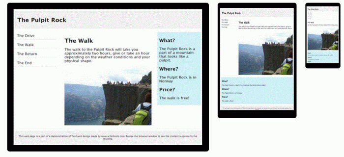
And w3Schools weighs in with the confidence of a co-creator declaring that “Responsive Web Design makes your web page look good on all devices (desktops, tablets, and phones). Responsive Web Design is about using CSS and HTML to resize, hide, shrink, enlarge, or move the content to make it look good on any screen:”
And without realizing it, in attempting to address the topic (the current state of RWD), I found the contrast with where we’ve been captured a better image of not only how far we’ve come, but the initiatives and frameworks being introduced almost daily even hourly as the true testament to where we are going.
This is also more social commentary than i had intended, so i apologize, but confess that i had such a good laugh at this May, 2015, very candid post from a designer/developer SitePoint member about being brought into the RWD world as he posts, ” the responsive design is usability crap; — big colorful buttons (intended for 5-year old kids?) taking over the entire screen, much too large font sizes to read normally, flat stupid looking icons, normal text menus being replaced by menu icons with fast food names” and that more and more all sites are looking alike.
Well, we know for a fact that we have moved on, if our emphasis on UI/UX has taught us anything, we have addressed each one of the charges that DaMarkov makes, and as a community we have done it both creatively and intuitively bringing a whole new world to the mobile and the desktop.
Viva la Responsive Web!
Wonder where we go from here?
PS i have to say that the DaMarkov blog struck quite a chord with readers and the discussion went on literally for months!
Bracey, Kezz. The State of Responsive Web Design,1 Jan 2015. Retrieved 22 Apr 2016, from EnvatoTuts+: http://webdesign.tutsplus.com/articles/the-state-of-responsive-web-design–cms-22878
DaMarkov. Responsive design has totally ruined desktop web experience (rant) , May 2015. Retrieved April 22, 2016, from SitePoint Forums: https://www.sitepoint.com/community/t/responsive-design-has-totally-ruined-desktop-web-experience-rant/189922.
Responsive Web Design (RWD): Promise and Limitations, August 5, 2013. Retrieved April 22, 2016, from Emerging Technologies Group: https://multimedia.telos.com/blog/responsive-web-design-rwd-promise-and-limitations/.

 Responsive Web 2016