Having fun with CSS3, W3.CSS, and Bootstrap
Firstly, you might be wondering what the difference is between these three names. CSS3 is simply the latest version of CSS (Cascading Style Sheets). This is the standard language used to style HTML. W3.CSS and Bootstrap are both responsive web design frameworks that allow easy web application customization by using classes.
One way you can make your web applications more exciting is by adding animations with CSS3 or W3.CSS. Animations allow you to change the style of an element easily without using JavaScript or Flash. The possibilities with animations are literally endless, so I’ll just focus on a few. For some examples of what you can do with animations, check out this site: http://1stwebdesigner.com/css-effects/
Icons
Both frameworks that we have mentioned, W3.CSS and Bootstrap, support the use of icons. An icon can be used anywhere on your site. You can put it in line in text, in your navbar, in headers and footers, forms, and even in buttons!
In Bootstrap, these icons are called glyphicons and there are 260 of them. You can use icons as symbols or you could make them hyperlinks, or use them to style buttons. Look at the following code:
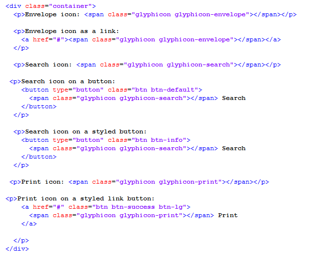
This is the output:

This is an example of a few different ways to use glyphicons with bootstrap. Notice that you must give it a class of glpyhicon and specify the name by typing glyphicon-glyphName. You can also resize the glyphs with the font-size property.
W3.CSS is a little different than Bootstrap in this aspect. They do not have any pre-loaded icons. Instead, you must use an icon library like Font Awesome Icons, Google Material Icons, or you can even use Bootstrap Icons. These are included by adding a <link> in the <head> of your web application.
Font Awesome Link:
<link rel=”stylesheet” href=”http://cdnjs.cloudflare.com/ajax/libs/font-awesome/4.4.0/css/font-awesome.min.css”>
Google Icons Link:
<link rel=”stylesheet” href=”https://fonts.googleapis.com/icon?family=Material+Icons”>
Bootstrap Link:
<link rel=”stylesheet” href=”http://maxcdn.bootstrapcdn.com/bootstrap/3.3.4/css/bootstrap.min.css”>
Using Bootstrap icons with W3.CSS is the exact same syntax as with Bootstrap. Using Font Awesome is very similar. You will still use class names to insert them, however instead of typing “glyphicon glyphicon-glyphName” you will type “fa fa-iconName”. For example:

Using Google Material Icons is a little different. You declare in a class name that you are using Google Icons by typing “material-icons” then you specify the icon name in the middle of the tag. For example:

You can also combine W3.CSS features such as animations or sizing to these icons.
Word-Wrap
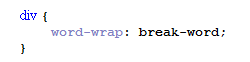
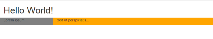
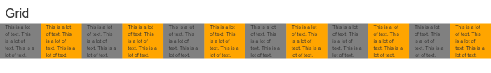
A very handy trick for responsive web design is the word-wrap property. This property allows you to break words midway if it reaches the border of its container. For example, you have a <div> that contains a paragraph of text. It is responsive so it shrinks down to a specified size when you resize a window or view on a smaller device. If we have a long word or url, the word/url will extend beyond the edge of the <div>. This is not desirable for aesthetic reasons. Here is an example without word-wrap applied:

Here is the same example with word wrap applied:

And here is the CSS to do it:
It really keeps your site looking tip-top to apply the word-wrap property to your elements!
Overflow
Another problem that several web applications have is the content going below the <div> This can be fixed by adding the following CSS:
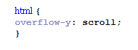
This will make the vertical scroll bar visible at all times, even if the content is smaller than the visible area of the application. This way the content will remain in the <div>. Note that there is an overflow-x for horizontal access.
CSS3 animations
In order to use CSS3 animations, you must specify keyframes using the @keyframes rule. These keyframes specify what styles the element will have at specific times. The second thing you must do is bind the keyframe rule to an element, for example:
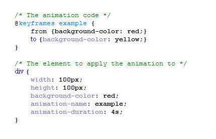
This says we are going to create an animation called example which will change from a background color of red to yellow. We then bind this with our div element by saying “animation-name: example;” and we also specify a duration for the animation. This means that the color will gradually change from red to yellow over a period of 4 seconds. Note that if you don’t input a duration, no animation will take place because the default value is 0.
There are so many different options that you can choose to use when using CSS3 animations that there is no way I could cover them all here. I recommend going to http://www.w3schools.com/css/css3_animations.asp if you are interested in seeing the different possibilities.
You can also check out https://daneden.github.io/animate.css/ for examples of animations.
W3.CSS animations
W3.CSS animations are even easier to use than CSS3. All you have to do is add a class to an HTML element. For example:

This example will fade the contents of the div in and out.
Although W3.CSS is easier, it doesn’t offer as much customizability as CSS3. W3.CSS allows you to slide elements, fade elements in, infinite fade in and out, zoom elements, and spin elements.
A cool trick is that you can add these animations to media queries! You do it the same way you would normally use a media query. This allows you to create animations for different devices based on their screen size which creates ultimate responsiveness!
There are several tips, tricks, and pointers that can make our lives easier when designing responsive web applications. There are also several things we can do to make our web applications more exciting. Between Bootstrap, W3.CSS, and CSS3, our lives have definitely become easier in regards to responsive web applications!
http://www.w3schools.com/bootstrap/default.asp
http://www.w3schools.com/w3css/default.asp
https://design.google.com/icons/
http://getbootstrap.com/components/


 Responsive Web 2016