You might be wondering what a media query is. Well, it is actually quite simple. A media query, simply stated, allows the size of the screen on your device to adapt the content of web applications to the screen size. For example, in the picture below, notice how the website changes its appearance based on the device? This makes viewing content on smaller devices easier while still retaining the integrity of the content.
Media queries are a part of CSS3 and are a W3C recommendation.

In addition to adapting the screen size of your device, media queries can also access the viewport, the visible area of a web page, the orientation and the resolution.
How to use them
Firstly, media queries are accessed by the @media rule and placed in your style sheet. Look at the following code:

This is the basic syntax to use a media query. This says that when the screen size is 480 pixels or more, the body will have a light green background color, anything less than this will have a background of light blue. This is what is known as a breakpoint.
You can also have more than one breakpoint. This allows you to have different styles for desktop computers, laptops, tablets, and cellphones all at once. Media queries can also access different stylesheets. The following example uses 3 different stylesheets based on the devices screen width:

Design for Mobile First!
When you are using media queries to create a responsive web application, always design for mobile first. What I mean by this is design your web application for mobile devices before designing for any other device. For example, we should change our styles when the devices width gets larger rather than when it gets smaller. This makes pages display faster for smaller devices.
Orientation
Another consideration when using media queries is the devices orientation because media queries can also be used to change the layout based on the orientation!
Using the same example as above, look at the following:

Notice that instead of passing a min/max-width, we gave it an orientation. If you were to look at this web application on a tablet, the background color would be light blue in portrait mode, but would change to light green if you flipped it to landscape mode. It knows that the device is in portrait mode when the window is taller than it is wide and landscape when the window is wider than it is tall.
We have just seen how to use the @media rule with CSS3 using min/max-width and orientations.
To view a list of the different media features such as these, you may visit: http://www.w3schools.com/cssref/css3_pr_mediaquery.asp
Bootstrap and Media Queries
Now that we have seen how to use the @media rule with CSS3, let’s see how the number 1 responsive framework, Bootstrap, handles this. In my previous post, I explained how the grid system worked. If you recall, I mentioned that there are 12 columns in the grid, Bootstrap allows you to put classes on these columns.
Consider the following:

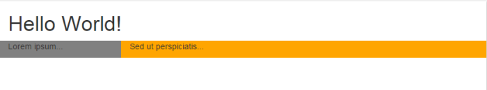
This code means that for devices with a “small” screen size (more on this in a bit), the first column will be of span 3 and the second column will be of span 9. Notice that their total adds to 12. In the above example, any device with a width smaller than the “small” size will cause these two columns to stack vertically.
Bootstrap predefines 4 sizes.
- xs for extra small, used for phones and spans 1 to 767 pixels
- sm for small, used for tablets and spans 768 to 991 pixels
- md for medium, used for desktops and spans 992 to 1199 pixels
- lg for large, used for larger desktops and spans 1200 pixels and above.
If we specify a column screen size, anything larger will be fine, but anything smaller will stack vertically. For example if we specify a col-md, anything smaller than 992 pixels will be stacked vertically, but anything above 992 pixels will remain as styled.
Bootstrap allows you to specify multiple column widths in one line. This way you can address the different devices you are styling conveniently. Consider the following:

Media queries are very simple and easy to use but can be used to accomplish huge tasks. They are a pretty awesome tool and when utilized in addition to fluid grid, can make for a powerful and responsive web application!
References:
http://zenit.senecac.on.ca/~dma502_141a15/wordpress/?m=201403
http://www.w3schools.com/cssref/css3_pr_mediaquery.asp
http://www.w3schools.com/bootstrap/bootstrap_grid_system.asp
http://getbootstrap.com/getting-started/
 Responsive Web 2016
Quite informative post about media queries.
LikeLike
Very nice Allen! I like both explanations on CSS3 and BootStrap! And, the orientation change with the different colors is great. I will definitely use that in the future…
~Carol
LikeLike
Excellent article Allen! Your demonstrations make the topic very easy to understand. I enjoyed reading the orientation part, and it was good to know that media queries can also be used to change the layout based on the device orientation!
LikeLike
Allen, you’ve done it again! This is wonderful and i so appreciate your demonstrating by showing us the actual code.
LikeLike
Very Very Informative Allen ! You have broken the topic down so well and explained in a good way. I enjoy reading this post, you even cleared some of my worries on this topic.. like if the work of viewport is different from that of media queries. Thanks for picking to explain this topic.
LikeLike
Excellent post Allen. Really admire your approach to make every topic so easy to understand. Thanks for sharing!!
LikeLike